Term 3: “Journey” – Week 6
Posted: June 9, 2015 Filed under: Level 4 Subject Leave a commentThis week I completed the video and amended it twice after showing Ian in our final crit. The final crit was really interesting as I got to see all the different pieces of work everyone has been working on for the past 6 weeks. It was particularly interesting as I haven’t seen any of the projects in any stage as most of us have just stayed home and developed and designed from there. There were so many inspired pieces of design ranging in a load of different formats. A personal favourite was a recipe design on “how to make the perfect graphic designer” – it was really unique, innovative and the aesthetic that it was approached with was high in quality.
In terms of my own video I was very happy with my final outcome:
At the crit it was a popular piece of work and I was told by many people that the song was really catchy which is exactly what I was hoping for. I was told by Ian as well that it was a good solid piece of work which was engaging because of the combination of image and sounds therefore I think its safe to assume it was a successful brief execution.
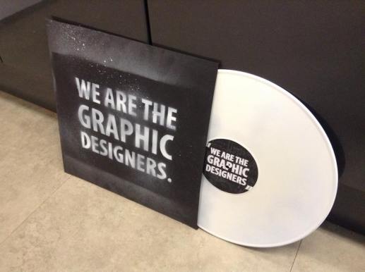
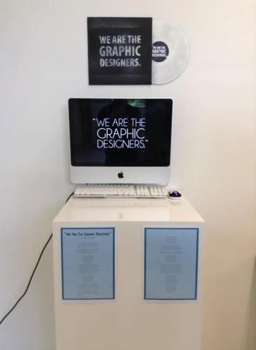
This week I also made a piece of extra graphic design specially for the exhibition space. I wanted to create some sign-age which touches on the format of my final outcome so I thought an LP vinyl and sleeve design would be an attractive and appropriate element. The use of the LP design is a direct reference to the musical aspects of my project but also more personally to me it references how during this first year of university I have become very interested in collecting and listening to records. The sign-age therefore is appropriate in what it is representing both in terms of format and in terms of my journey. The LP vinyl, cover and label were made with black card, white spray paint over a stencil, a spray painted vinyl and a digital printed image:
With the main aspects of the project now finished I just need to exhibit the work in a space and hopefully this shouldn’t be too hard. Overall I have thoroughly enjoyed this project – it has been very new and experimental for me as I don’t usually write songs or perform them as part of a project for a course. It was quite a challenging experience as re-writing a timeless classic using graphics terminology is not an easy task and recording a song is also a lot harder than I originally anticipated. The difficulty however made the final outcome all the more satisfying and I’m happy that people appreciate the song so much which is something I really hoped would happen.
Term 3: “Journey” – Week 5
Posted: June 6, 2015 Filed under: Level 4 Subject Leave a commentBelow is a slide show showing the lyric cards I have spent all of this week making:
Almost all of the cards have been designed using imagery associated directly with what that particular lyric is talking about. For example the type design lyric cards have been designed with a hand-drawn effect to mirror ideas of hand-drawn type and type design – furthermore, typographic terms have been incorporated into the designs touching on type theory also. I am very happy with the lyrics cards I have designed as along with the song they should make an engaging piece of work which captivates the viewer because of the matching accompanying visual.
This week I also recorded the song using my guitar, my voice and my friends’ voices (only for the chorus). It was a fairy difficult process as I had to record my voice while listening to the guitar which I had previously recorded. This meant I had to record the song in segments as to avoid the timing messing up. However the final song outcome was very high quality and catchy too – I think I may have made the theme tune for our Year group!
Term 3: “Journey” – Week 4
Posted: May 29, 2015 Filed under: Level 4 Subject Leave a commentThis week I managed to write the entire song for the video (it took the better part of 5 days!). At first I was going to try and re-write the lyrics to “Never Gonna Give You Up” but after re-consideration I thought that a song which has more lyrics and potential for a content rich song would be a better option. I decided to go with Billy Joel’s “We Didn’t Start The Fire” as this is an iconic tune from the 80s which everyone recognises. Furthermore the song is hugely appropriate for this project as the song itself takes the listener on a journey through time creating an aural time-line of events. This makes the structure of my journey a lot easier to put into lyrics as a set structure is already laid out. The song has very dense lyrics and any syllables which gave me a great canvas to work in all the content I wanted to include. Here are the lyrics below:
Cornwall, Cardiff, moving day, 197 miles away,
Flat mates, shopping, drinking, dropping, uni the next day,
Image making, second day, collaging, talking to Ray
Storyboarding, endless drawing, student life begins
Representing imagery, industry and chimneys,
Organic life and factories and mass reproduction themes,
Photoshop, illustrator, colour filters, vector makers,
CMYK, RGB, layers and opacity
We are the graphic designers,
We know all about kerning
And our passion is burning.
We are the graphic designers,
And if we didn’t design it,
We’re inspired to try it.
Type design and letterforms, ligatures, and Clarendon,
Majuscule and miniscule – thirteenth century,
Serif fonts are Roman bound, Geometric types are round,
Fat Face, all caps, 19th Century.
Sans serif, blocky fonts, comic sans not even once,
Italics slanted to the side, Lombardic versals – “story time”,
Scripted type, calligraphy, born in 1950,
Transitional and humanist, centaur and the gothic.
We are the graphic designers,
We know all about kerning
And our passion is burning.
We are the graphic designers,
And if we didn’t design it,
We’re inspired to try it.
Baby cage, essay task, controversy, art facts,
Key notes, blog on-line, Constellation deadline,
In a rush, Blackboard sucks, library books and journal stuff,
Messed up, begin again, what the hell is referencing?
Story telling, many kinds, tragedy, Lord Of The Flies,
Rag to riches, Cinderella, overcoming monsters,
Rotoscoping, animation, tedious and aggravating,
Days and weeks to draw the scene, results are always quality.
We are the graphic designers,
We know all about kerning
And our passion is burning.
We are the graphic designers,
And if we didn’t design it,
We’re inspired to try it.
Field module, city theme, try new things, work as a team,
Aliens, the supernatural and mythology,
Migration looked at travelling, power ran on bigger things,
Hidden city, urban theories – things you wouldn’t see.
Fine art and ceramicists, wasn’t sure that this could mix,
Frustration leading to creation, came out with an installation.
We are the graphic designers,
We know all about kerning
And our passion is burning.
We are the graphic designers,
And if we didn’t design it,
We’re inspired to try it.
Choice of type face, title size, hierarchy, type crimes,
Rivers, widows, hyphenation, static type justification,
Green on purple, red on blue, what has graphics come to?
Over here and over there, bad design is everywhere.
What I hadn’t seen before, now I notice more and more,
Adverts using Comic Sans, posters using Jokerman,
Absent grid, no align, un-necessary underline,
Oh how it makes my skin crawl, I wish that I could change it all.
We are the graphic designers,
We know all about kerning
And our passion is burning.
We are the graphic designers,
And when this year is done,
We’ll keep designing on, and on and on and on,
And on and on and on and on…
We are the graphic designers,
We know all about kerning
And our passion is burning.
We are the graphic designers,
And if we didn’t design it,
We’re inspired to try it.
(x3)
The content included in the song consists of many, many things, here are a few examples:
- Moving away
- Image
- Drawing
- Planning
- Subject
- Constellation
- Field
- Typography
- Animation
- Drinking
- Frustration
- Constellation
- Essays
- Deadlines
- Blackboard
- Theory…
I am very happy with the final lyrics – they capture almost all aspects of my first year in graphic design. There is however much less content devoted to student life however but I think that a song based predominately on graphic design and my learning of this is a much more appropriate response. I think that I am going to have record myself singing it though (with the help of some friends for the chorus). This makes me feel quite nervous as this sort of project is definitely something that takes me out of my comfort zone. However, despite this I’m feeling less anxious about having to present ideas or projects in front of a large group – this project may be the perfect way to prove how much I have changed in terms of my confidence.
Term 3: “Journey” – Week 3
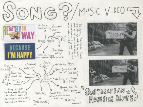
Posted: May 22, 2015 Filed under: Level 4 Subject Leave a commentThis week my project went though quite a substantial development process which changed a key aspect of the entire project. It started when I was looking back at the mind-map of potential content I made. I read the content back to myself reading every word aloud and quite quickly. I noticed that the speed I was saying the words at made the read content sound like a song or rap. I thought about the possibility of a song being written but with serious intent at that point (I considered it as a simple development possibility). At a tutorial with Ian on Monday I discussed the idea of a song and possibly some sort of visual to go with it – Ian said that the idea is innovative and could work really well (wasn’t expecting that). I was shown an example of a lyric video for a Bob Dylan song called “Subterranean Homesick Blues” which shows Dylan using simple lyrics cards for each key word in a line of lyrics:
I really liked the simplicity of the video as it created an engaging experience with the viewer due to the combination of imagery and sound which was in time with each other, however the video isn’t content rich due to the use of only one word per line in the song. My project must be content-rich and engaging therefore I will consider the style given to this video but try and develop my own video. In terms of song writing I thought that the song I could write could be to the tune of a pre-existing song which is classic and recognisable. This is to better the engagement with the viewer as it will be a tune that people can relate to. My best bet is probably a song from the mid 80s like “Never Gonna Give You Up” or “Don’t You Want Me”. I really need to get the song written though as I can’t do anything visual until that part of the project is done!
Term 3: “Journey” – Week 2
Posted: May 16, 2015 Filed under: Level 4 Subject Leave a commentThis week I put most of my focus on the content of the video. The idea that has stuck in my head the most is the incorporation of the alphabet into the video/animation in there somewhere. The idea I had visualised in my head is an alphabetical animated video which would go through different memorable things I have picked up through my first year e.g.
- “A” is for “Art & Design”
- “B” is for “Baby Cage”
- “C” is for “Constellation” etc.
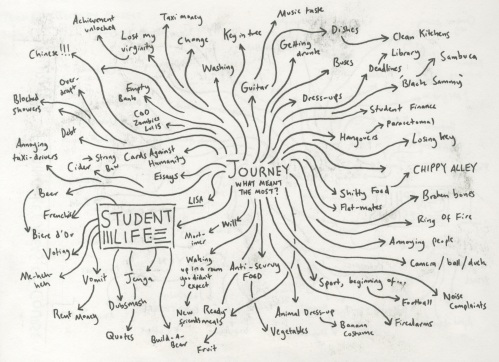
The idea I had in my head however was only vague and I hadn’t at all visualised it. I took the idea to a tutorial with Ian and discussed the idea in association with the alphabet as a structure or element. Ian thought that the concept of the alphabet was interesting and could work however if I am going to use the alphabet in the project it should be a hidden element or used implicitly rather than out in the open and explicit. Furthermore in the tutorial we discussed the idea of what they want from us in terms of a “journey”. I discussed that I come from Cornwall and coming to Cardiff was a very big step for me – Ian said that step has a sense of adventure and that that it what they want to see, a piece of work that describes exciting adventures and movements and developments through the year. After the tutorial with Ian and after another with Olwen I went home and mind mapped every possible piece of content I could add to the video. These included both graphics associated content and content associated with student life as well. I have another tutorial on Monday so I can discuss further ideas then. To be completely honest I’m feeling quite unsure about this project as I am really struggling with idea generation and thinking of a definitive idea. I never really struggle with projects this far in, i’m going to blame it on essay-based-stress and try and pull my act together.
Term 3: “Journey” – Week 1
Posted: May 10, 2015 Filed under: Level 4 Subject Leave a commentThis week I began to think about possible ideas for the project “Journey”. The project we were briefed on asks us to create a piece of work which shows our journey through Year 1 of the course. The concept of journey itself is a very wide topic and can include any of the following:
- Things we’ve learnt in subject, constellation and field
- Things we’ve enjoyed
- Things we haven’t enjoyed
- How you as a person have developed over the course of 1 year
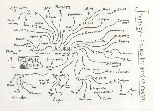
This is a lot to fit into one project but there’s so much that we’ve done this year that it isn’t impossible. Particularly I’m quite interested in the idea of exploring things that are exclusive to student life rather than JUST what we learnt in the studio or at uni. This means I would explore things like hangovers, student finance, sleep etc. as well as things like typography, composition, theory, constellation etc. With this in mind I created two mind-maps looking at things that are specific to graphic design and one specific to student life:
Another thing I did this week was create some expressive type forms as to begin exploring visual possibilities for each theme I have brought up in the mind-map. The type forms consist of every letter in the alphabet and refer back to a point raised in the mind-maps (except for X, Y and Z because I have no idea!). After looking at these mind-maps and illustrations I began thinking about possible formats for the actual project – I am certain that I want to make some sort of video or animation and this is an area I am very strong in both in and outside of the course. However despite knowing the medium that I want to work in I am unsure as the what the actual video will be about or how it will be done. Rotoscope? Frames? Filmed footage? I definitely need to think more about this and even more about what aspects of uni/student life the video/animation will focus on.
The Prophet’s Epiphany – ANIMATION SEQUENCE (unfinished)
Posted: December 16, 2014 Filed under: Level 4 Subject Leave a commentBelow is as much of my rotoscoped animation that i could get done:
Upon showing the class and Ian i was greeted with positive reviews that were mostly about the choice of music and sound effects and how these match up well with story and compliment the narrative. However that being aid there are some things that need to be changed as to improve the animation as a whole – the opening shots don’t appear to have enough continuity due to the varying shades of the moon and how this appears to stay static while the clouds/leaves are animated. As these are establishing shots these are highly important and must be visually impressive and attractive otherwise the audience loses interest in the animation.
The Prophet’s Epiphany – STORYBOARD ANIMATIC
Posted: December 16, 2014 Filed under: Level 4 Subject Leave a commentAfter a review about my storyboard i was told that the shots chosen were distinct and illustrated well the narrative and this was reinforced by my drawings. However a issue with the storyboard was that it didn’t show very well the duration of each shot or transitions between the each shot. I was instructed to make an animatic which is a video of a story board showing each frame in its actual intended duration including sound effects, transitions and ken burns. Below is the animatic ready for review:

